
Get Color! - Playing along at home

Host Jane Lockhart from "Get Color!"
I justify my addiction by saying that I'll apply what I learn some day. Some day I'll use all this information to the good of my home.
Today is that day. Today I'm going to use the principles from the show "Get Color!" to design my bedroom (to be honest I've been planning this for a while.. so some of the pieces are already in place).
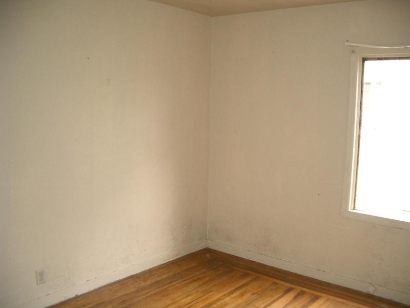
View of the southwest corner of the room
Up until now I've always lived in apartments where I wasn't allowed to paint the walls. All of my color choices have been in furnishings. This will actually be the first time ever that I've been able to choose a color and paint the walls. I'm very excited about that.
Establishing the feel: Choosing our personal color wheel
We're starting with a bedroom that is moldy, cold and depressing. I want a bedroom that is elegant, warm and inviting. It should be a peaceful, relaxing place. The room faces north which brings in a cool-blueish light. I don't want the room to feel cold.I'm going to base my personal color wheel on colors found in the Napa Valley. Napa is just slightly north of me.. and I'd love to live there (can't afford to buy property there.. and the commute would kill me). If I can't live there.. I can bring that feeling to me. Wine tasting, French Laundry, B&Bs, and vineyards, these are the things that say "Napa" to me.

The colors of the Napa Valley
Jumping off point: The hardwood floors.

Choosing a wall color

The Yellow-Orange is on the warm side of the color wheel. It is very closely tied to the brown as they're side-by-side on the color wheel. This makes for a harmonious combination. This color will also cause the walls and the hardwood floors to blend together.

Red is a very bold color. It's on the warm side of the color wheel so it will bring a lot of energy to the room. It's tied very closely with the brown as they're only separated by a couple of places on the color wheel. This will cause the walls and the hardwood floors to blend together.

The Green is on the cool side of the color wheel. This color on the walls will contrast with the hardwood floors. This color will draw more attention to the floors.
I choose to go with the Yellow-Orange. Although I'm really tempted by the Red, I know Marc would never go for it. He's very anti-Red. The green, on the cool side of the wheel, doesn't mesh well as a wall color to bring warmth to the room.
So we went with Yellow-Orange. Specifically, Kim over at "One Woman's Cottage Life" recommended "Clarified Butter" from American Traditions. It's a perfect combination of bright without being too yellow or too orange. (at this point, if I was being true to the show, I should have some bubble about the effect of yellow-orange on mood.. but I don't know the effect.. so just pretend you saw a cool bubble here.)
Stay tuned for more after this commercial break...
Visit the Get Color! website at HGTV.com.
More information about colors and the color wheel:
http://www.worqx.com/color/color_wheel.htm
* Ok, for the sake of honesty I have to admit.. we've already painted the room.. . This was still fun. Even when I already knew the outcome.
Tags: Northeast Bedroom
Comments
I wanted to knoe if your show ever travels toward my neck of the woods in south texas. I am in desperate need for advise with my one bedroom condo that i will be moving in soon in aug. Love your show.
thank you
jennifer rivera
Posted by: jennifer rivera | April 21, 2006 8:08 PM
I'm glad that you like the show.. but this is -not- the official "Get Color!" website. YOu'll need to go over to HGTV to find that.
This is just my poor version of applying the knowledge from that show to my situation.
Good luck.
Posted by: Monica | April 22, 2006 10:20 PM